This image was My base image for black and white. I de-saturated it and adjusted the contrast and brightness a hair. just enough to give the shadows a little more darkness but not over run.
In this image I upped the contrast ans brightness up a little and I dodged the whites on the bench and where the sun hit the image. It gives it more contrast and makes you focus on the benches.
This one is My favorite. I left the image alone from the previous but I burned the shadows dark to give it a very strong contrast and canceled out the faint markings in the bricks where the sun didn't hit. It is very strong photo with the main returns in the middle of the photo.
I gave this one a blue "Cool" tone. it gives it the black and white look but keeps all the detail in the image where you can still see the minor things. The whites still pop out in this one also
My final Picture I did Sepia. Its more of a warmer photo with a warmer red color that warms the image you get the color and detail of the bricks while also keeping the shadows and the brightness of the lighter areas where the sun hit the most.


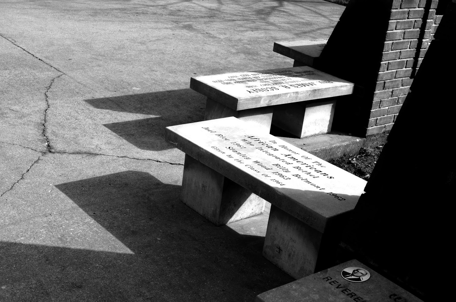


I like the bench idea, as the sunlight makes shadows that can be played around with. Nice job!
ReplyDeleteNot bad, Dillon. Your choice of composition was a good one for this assignment. The strong lines and sharp contrasts of value are working quite well. You varied up you images nicely so that there are definite, noticeable differences between each.
ReplyDeleteDillon, I love the gradual changes you made to the black and white photographs, each one has it's own presence. My favorite of the black and white photos is the second one because I enjoy the brightness of the benches but you see some of the memorial bricks in the back rest of the seat to the right. It looks weathered and full of age which I admire. The blue one is interesting because of the amount of blue you put in the photograph. The last one is very nice as well because it has the nice emphasis on the redness in the bricks. Great job!
ReplyDeleteDillon, I really love your second photo. The letters and small photo struck my eye. Also the shadows keep my eyes moving across the photo in a zig zag. It is a fun photo to look at and extremely appealing to the eyes because of the movement. I don't know if you did this on purpose but the content in which the closest bench has engraved into it is praising the African American community who integrated Bethel in 1963. Thought that was cool, it being Black history month and a black and white image. I guess you could say your photo is well integrated.
ReplyDeleteI love all of these! My favorite is the one in the cool blue tone. You can tell you still kept your values in mind and didn't just turn it blue. Every value stands out on its own! really nice photos
ReplyDelete